Make Azure DevOps look pretty

When I’m working with some tool, I’m looking for a way to customize it, especially when it comes to themes :)
I’m a big fan of dark themes. In Azure DevOps, there is one available by default, but you can enable more, better-looking, themes.
You can select your theme by clicking on the User settings icon and selecting the Theme option:
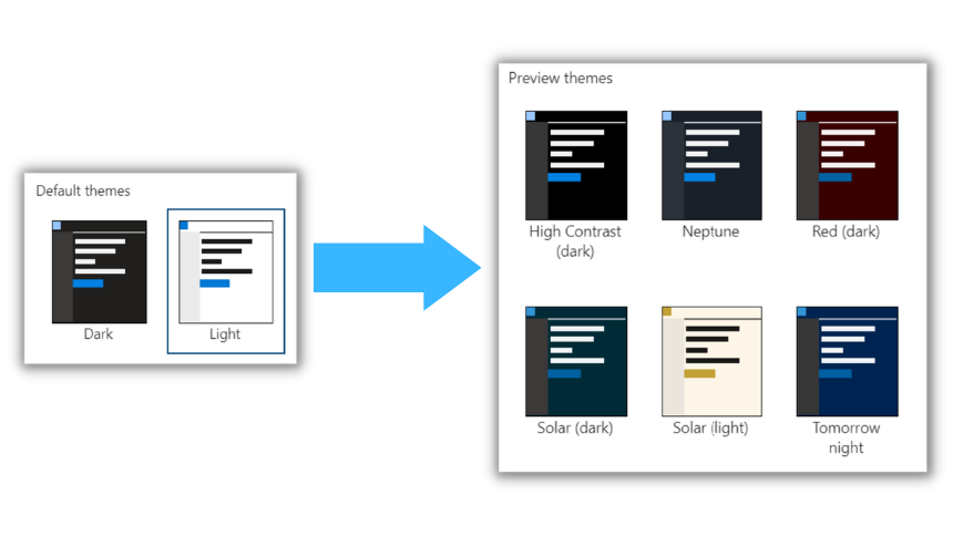
By default in Azure DevOps, we can choose between Light and Dark themes.
Are you interested in staying up-to-date with the latest developments in #Azure, #CloudComputing, #PlatformEngineering, #DevOps, #AI?
Follow me on LinkedIn for regular updates and insights on these topics. I bring a unique perspective and in-depth knowledge to the table. Don't miss out on the valuable content I share – give me a follow today!
You can easily get more themes by enabling Experimental themes!!
Just click on the User settings icon, then Preview features, and enable Experimental Themes:
This option will add 12(!!) new themes:
- Blue
- Dark editor
- Fall
- Green
- Quiet
- Red
- High Contrast (dark)
- Neptune
- Red (dark)
- Solar (dark)
- Solar (light)
- Tomorrow night
My favorite one is Neptune:
Let’s compare it to the standard Dark theme:
Which theme will you choose? :)
Do you like this post? Share it with your friends!
You can also subscribe to my RSS channel for future posts.